When you first open a spectrum analyzer, the thing that catches your eye is a bar or line graph jumping across the screen. It's easy to feel uncertain about which mode is the default, and what actually changes when you switch to a different view. Vocal Spectrum offers three graph modes — Bar, Line, and Circle — and each one visualizes the same underlying frequency data in a different way. None of them is universally better or worse; the right choice depends on what you are trying to see. This article explains how each graph works, what it shows well, what it shows less well, and which situations call for which view.
Why You Are Looking at a Spectrum Graph — Harmonics, Formants, Tone Color
Before comparing the three views, it helps to be clear about why you would look at a spectrum graph in the first place. Having that purpose in mind makes the choice between views straightforward.
Understanding harmonic structure. The human voice does not produce a single, pure frequency. It produces a fundamental frequency (F0) along with a series of overtones at integer multiples of that fundamental — the harmonic series. A tenor singing C3 (131 Hz) simultaneously produces 262 Hz, 393 Hz, 524 Hz, and so on. The pattern and relative strength of these overtones determine the timbre of the voice. A spectrum graph shows this pattern in real time.
Tracking formants. Formants are frequency bands that the vocal tract amplifies through resonance. The first formant (F1) is primarily related to the degree of mouth opening; the second formant (F2) is related to the front-to-back position of the tongue. Every vowel — "a," "e," "i" — has a distinct formant pattern. In a spectrum graph, formants appear as peaks where energy is concentrated in a particular frequency band. Watching how formant positions shift when you modify your vocal technique is one of the core uses of spectrum analysis for singing.
Understanding tone color. The same pitch can be sung bright, dark, warm, or sharp depending on how energy is distributed across the frequency range. Strong high-frequency energy produces a bright, cutting sound; dominant low-frequency energy produces a dark, rounded sound. Comparing your intended tone with the actual spectrum and adjusting your production accordingly is the central work of tone shaping.
The three purposes — harmonic structure, formants, tone color — each favor different views.
Bar Graph — The Most Intuitive View for Harmonic Pattern Analysis
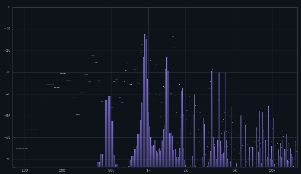
Separate bars per frequency bin let you compare fundamental and overtone heights directly; the Singer's Formant region (around 2500–3000 Hz) shows up as bars that stand taller than their neighbors.
The Bar graph represents the energy in each frequency bin as an independent vertical bar. The height of each bar is proportional to the sound pressure level (in dBFS) at that frequency band.
The reason Bar is the most intuitive view for harmonic pattern analysis is its discreteness. Each bar stands separately, making it easy to compare energy levels across specific frequency bands at a glance. You can directly see where the fundamental frequency bar sits, how the harmonic bars are arranged alongside it, and whether any particular harmonic is unusually strong or weak.
Bar is also well-suited for observing the Singer's Formant in trained voices. Research from Stanford's CCRMA indicates that trained singers develop a prominent energy peak around 2500–3000 Hz, which is responsible for the "ring" and projection of the classical voice. In the Bar graph, this appears as bars in that band rising clearly above their neighbors.
The limitation is that fine continuous changes in the spectral curve are harder to read. The gaps between bars obscure the overall shape of the energy curve, so for reading broad spectral contour, the Line graph is more appropriate.
Practice application: When transitioning between chest voice and head voice, watch the Bar graph to see how the harmonic pattern shifts. Chest voice typically raises the low-frequency bars; head voice raises the relative contribution of higher-frequency bars. A sudden, abrupt change in this pattern marks the passaggio.
Line Graph — Best for Overall Spectral Curve and Formant Identification
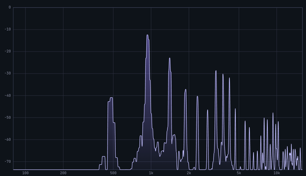
The continuous curve makes formant peak position and width, and the low-to-high energy slope (spectral tilt), easy to read at a glance — ideal for tracking F2 movement when you change vowels.
The Line graph represents the same data as the Bar graph as a continuous curve, connecting each frequency point's energy value into a smooth line.
This view is best for reading the overall shape of the energy curve. Formants appear in a spectrum as peaks — energy hills at particular frequencies. The position and width of these hills are much more legible in the Line graph than in the Bar graph, where the gaps between bars can make the peak shape ambiguous.
Formant movement during vowel transitions is more clearly visible in the Line graph. Singing the same pitch while switching from "a" to "i," for example, causes the F2 formant to shift toward higher frequencies. The direction and extent of that shift can be tracked as the movement of a peak along the curve.
Spectral tilt is also easiest to read in the Line graph. In general, a voice's spectrum slopes downward from low to high frequencies — energy decreases as frequency rises. A steeper slope corresponds to a darker sound; a shallower slope, or one with significant high-frequency energy remaining, corresponds to a brighter sound. The line makes this gradient immediately visible.
The limitation is that precise comparison of individual harmonic bar heights is more difficult. When you need to see exactly how strong a specific overtone is relative to its neighbors, Bar is the better choice.
Practice application: Sing the vowels "ah," "eh," "ih," "oh," and "oo" on the same pitch in sequence and watch how the Line graph peaks shift position. If you can see the F2 peak moving rightward (toward higher frequencies) as you move from "ah" toward "ih," you are simultaneously training vocal tract acoustics through both sound and sight.
Circle Graph — Seeing the Overall Frequency Distribution at a Glance
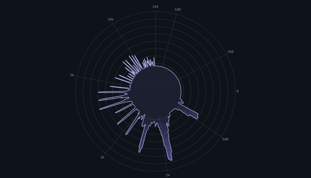
Angle from the center represents frequency and radius represents energy, so the whole tone distribution appears as one shape — useful for comparing the big picture before and after a technique change.
The Circle graph uses polar coordinates. The direction from the center of the circle functions as the frequency axis, and the radial length in each direction represents the energy at that frequency. The entire frequency spectrum is spread around the circle in a single visual shape.
The primary advantage is being able to see the entire frequency distribution simultaneously. Where Bar and Line graphs are read left-to-right (low frequency to high), the Circle graph presents the full energy distribution as a single unified shape. Whether low-frequency energy dominates, high-frequency energy dominates, or energy is distributed evenly is apparent from the shape of the circle alone.
Circle is also useful for memorizing the overall "shape" of a particular vocal technique. When the voice is in a strong, resonant state, you can note what the Circle graph looks like. When a similar shape appears in later practice, it confirms that the same resonant condition has been reproduced. Shape recognition is more immediate and intuitive in Circle than in the other two views.
The limitation is that Circle is not suited for precise numerical analysis. For reading the exact energy level at a specific frequency band, or for analyzing how harmonics are arranged in detail, Bar or Line is necessary. Circle shows the big picture; it is a low-resolution tool.
Circle is ideal for quick tone checks. Use it to get a rapid sense of whether today's voice is tonally similar to yesterday's, or to immediately see whether changing a technique has shifted the overall energy distribution.
Practice application: Sustain a note in chest voice, note the shape of the Circle graph, then switch to head voice and observe how the shape changes. Head voice tends to redistribute energy toward higher frequencies, changing the form of the circle. Training the transition to happen gradually, rather than abruptly, is the goal of register transition work — and the Circle graph makes the abruptness or smoothness of the shift immediately visible.
Peak Hold Lines: 1.7-Second Hold, Then Gradual Decay
All three graph modes share a common feature: peak hold lines. These are secondary lines that briefly hold the highest energy level recently reached at each frequency band, then slowly descend.
Peak hold lines hold the maximum for 1.7 seconds before beginning to fall. This window is long enough for a short consonant burst to remain visible well after it occurs, and short enough that the hold line does not linger so long that it becomes confused with the current real-time signal.
In practical terms: peak hold lines show where in the frequency range strong energy spikes occurred — for instance, how high sibilance peaks reached during a consonant, or how prominently the Singer's Formant region rose during a sustained vowel. This information would vanish too quickly to catch without the hold.
The peak hold line works identically in all three modes. Switching between modes does not reset it: you can check peak positions in Bar, then switch to Circle to assess the overall shape, with the peak information retained throughout.
The top panel also displays four numerical metrics: PEAK (Hz) — the frequency currently carrying the most energy; LEVEL (dBFS) — the energy at that peak frequency; CENTROID (Hz) — the spectral center of gravity across the full range; and RMS (dBFS) — the average sound pressure across the full range. Reading these numbers alongside the peak hold line gives you a quantitative snapshot of the current vocal state.
Recommended View by Practice Situation
Based on the characteristics of each graph:
For harmonic pattern analysis → Bar graph. Bar shows each harmonic bar individually, making it easy to see how harmonics are arranged and whether the Singer's Formant band (2500–3000 Hz) is sufficiently prominent.
For overall spectral curve and formant analysis → Line graph. Line shows the shape of the energy curve, the positions of formant peaks, and spectral tilt most clearly. Use it for vowel transition practice and tracking formant movement when changing vocal technique.
For an at-a-glance overview of tone distribution → Circle graph. Use Circle to quickly assess your vocal state at the start of a session, or to see immediately whether a technique change has shifted the overall energy distribution.
For diagnosing a vocal problem, the most effective approach is to use all three views in sequence. Start with Circle to assess the overall energy distribution, move to Line to check formant positions, then use Bar to examine the strength of specific harmonic bands in detail.
How to Switch Views in Vocal Spectrum
Switching graph modes in Vocal Spectrum is straightforward: click the Bar, Line, or Circle button on screen and the view changes immediately.
Adjusting the frequency range and sensitivity alongside the view selection extracts more information from each mode. The default range of 80 Hz to 16 kHz is appropriate for most vocal work. For intensive sibilance analysis, raising the upper limit to 22 kHz is useful. For inspecting the low register, lowering the floor to 20 Hz makes the bass fundamental visible. The sensitivity slider (0.001–0.1) should be set higher in quiet environments and lower in environments with background noise to maintain a clean signal.
Connecting with Other MusicalBoard Tools
Spectrum analysis is significantly more powerful when combined with other tools.
Using Vocal Pitch Monitor alongside Vocal Spectrum lets you monitor pitch accuracy and spectral state simultaneously. When pitch fluctuates, watching how the spectrum changes at the same moment helps pinpoint what is happening in the voice.
Recording with Singing Recorder and playing back synchronizes the spectrum graph with the playback head. Navigate the progress bar to any point in the recording and view the spectrum at that exact moment — in Bar, Line, or Circle — to analyze a passage from multiple angles.
Practicing with MusicalBoard Vocal Spectrum
Vocal Spectrum runs instantly in the browser. Grant microphone permission and real-time spectrum analysis begins. No installation, no account — all processing happens on the device.
Switching graph views is a single click. Peak hold lines operate automatically in every mode, holding the maximum for 1.7 seconds before descending. The PEAK, LEVEL, CENTROID, and RMS values in the top panel connect quantitative data to the visual graph in real time.
A natural starting point: begin with the Bar graph to observe your fundamental harmonic pattern. As that becomes familiar, move to Line to track formant positions, and to Circle to assess overall tone distribution. Developing the ability to choose the right view for each situation transforms spectrum analysis from abstract number-watching into a practical instrument for improving your voice.